Kami Rebrand
Year: 2025
Role: Design Marketing Lead
Responsibilities: Led the brand refresh, visual system, guidelines, and rollout across key touchpoints.
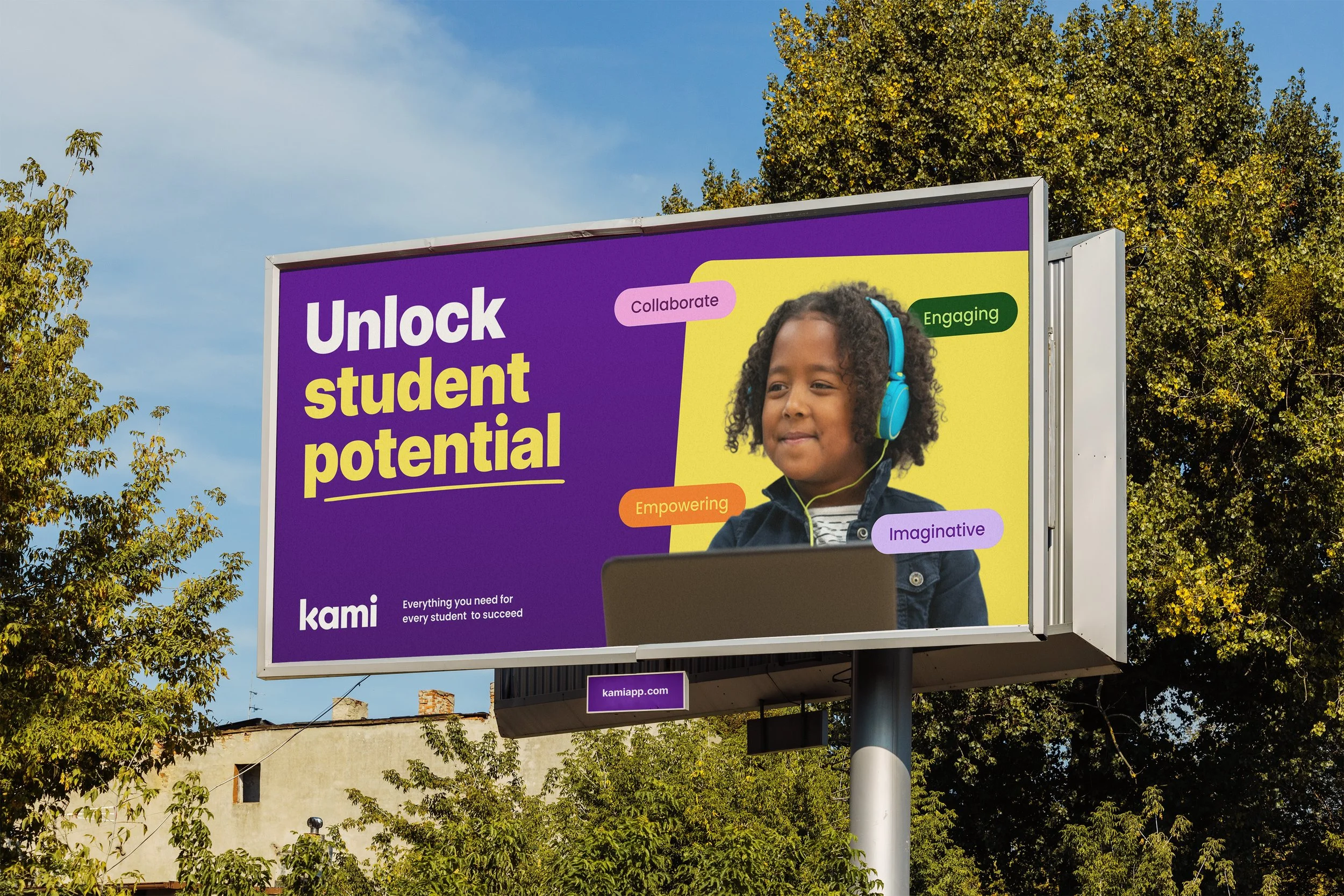
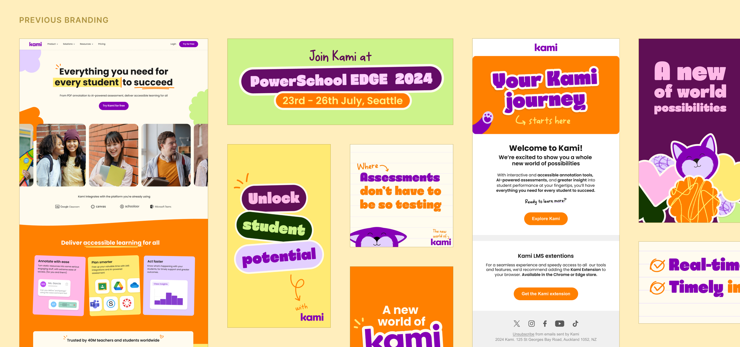
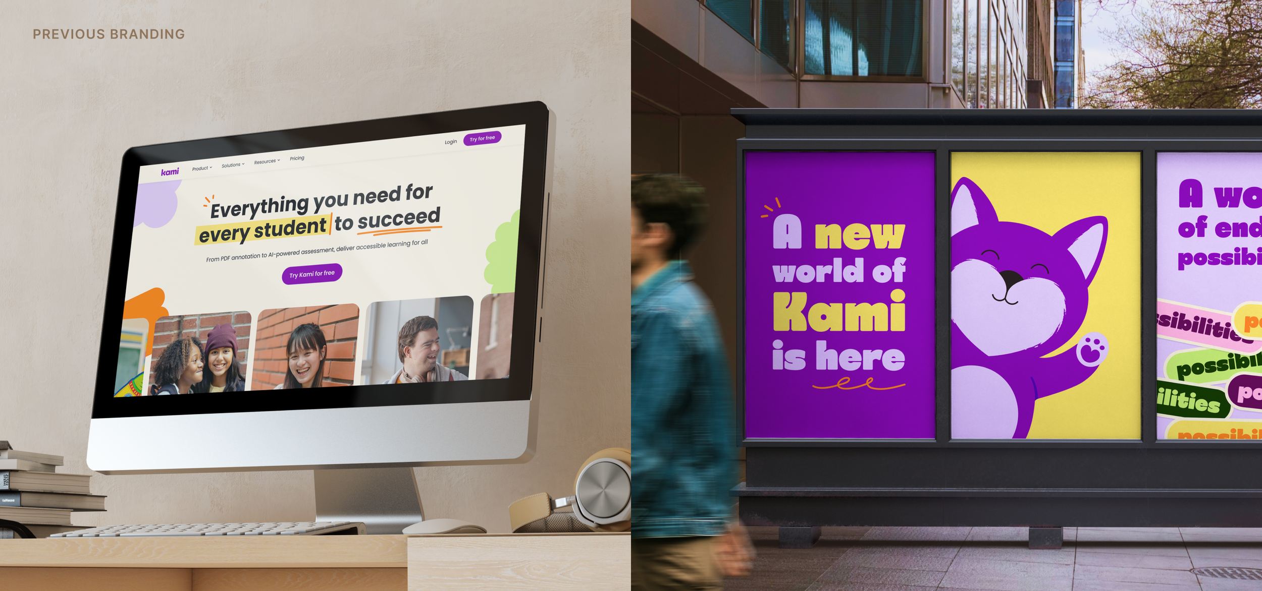
Kami had strong recognition with teachers, but as the company grew, the brand had become harder to scale across web, campaigns, product marketing, sales and events.
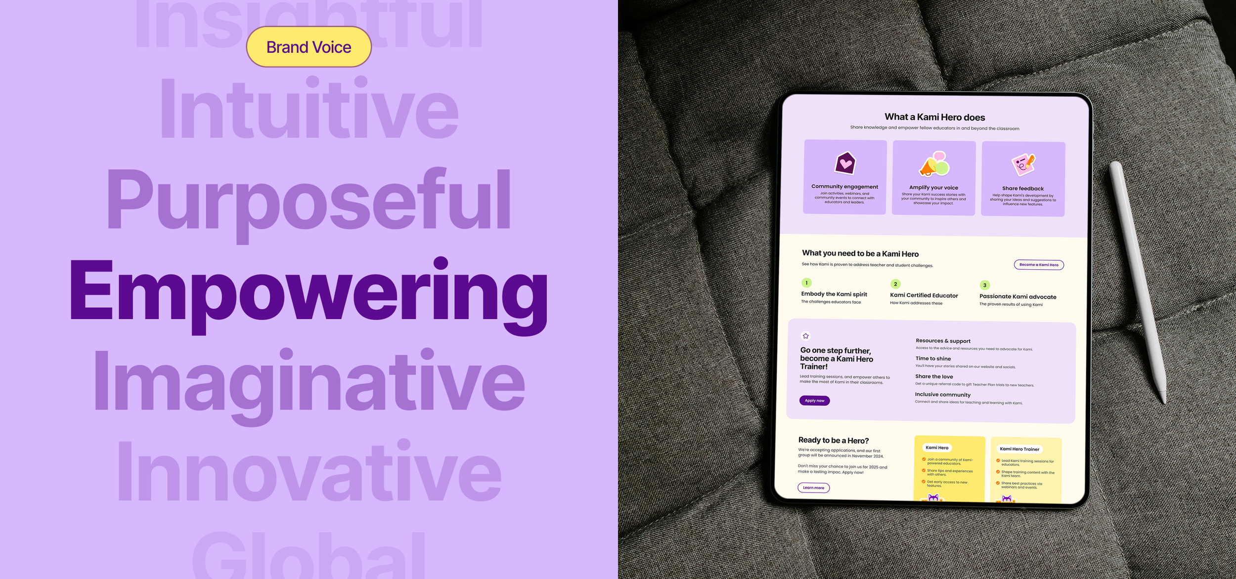
I led the rebrand to create a more mature, flexible and recognisable system that kept Kami’s classroom warmth, while giving the team clearer rules, templates and guidelines. The goal was to help Kami communicate more consistently with teachers, school leaders and decision-makers, and support a stronger platform story as the business moved beyond a single classroom tool.
Repositioning Kami for scale
Impact
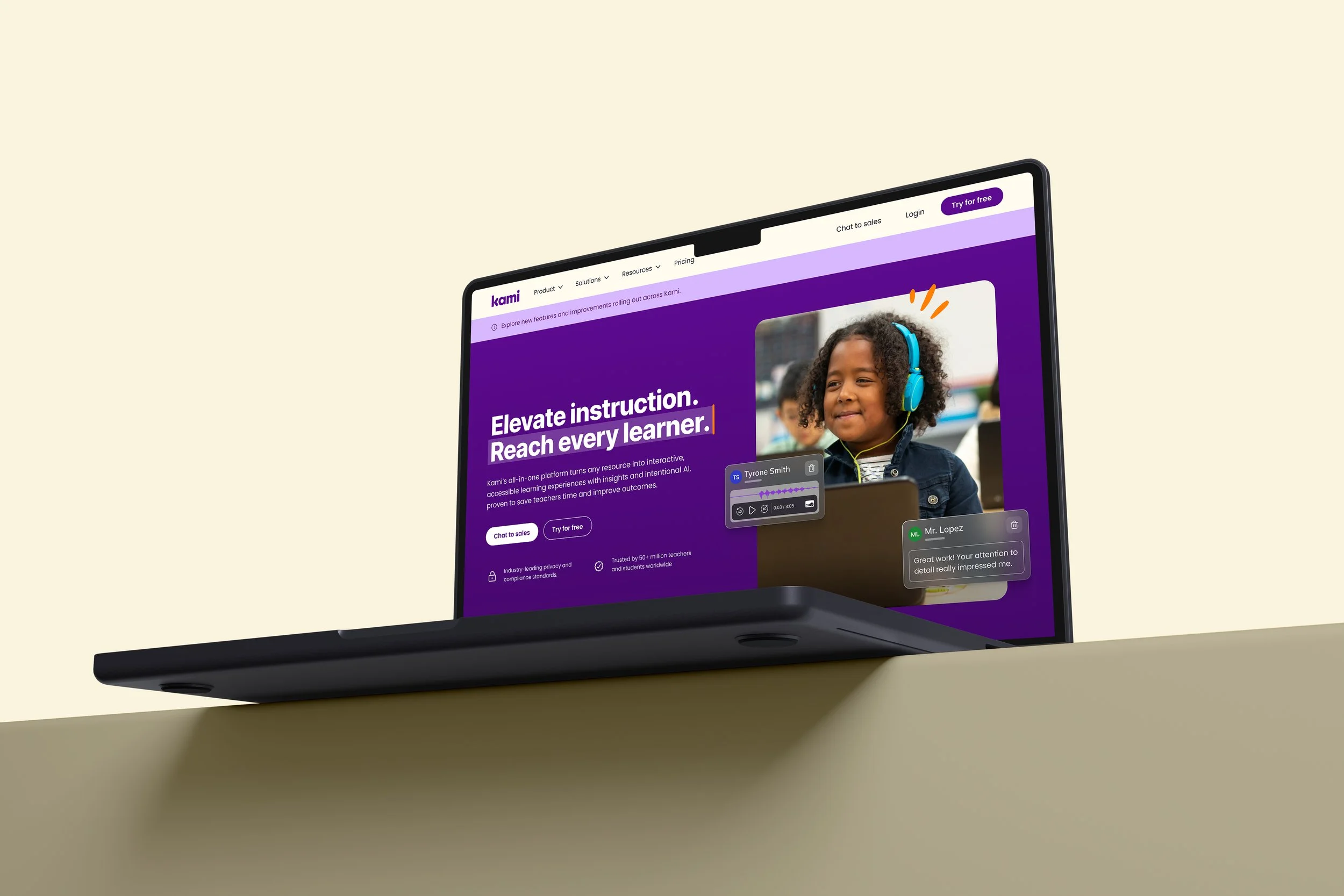
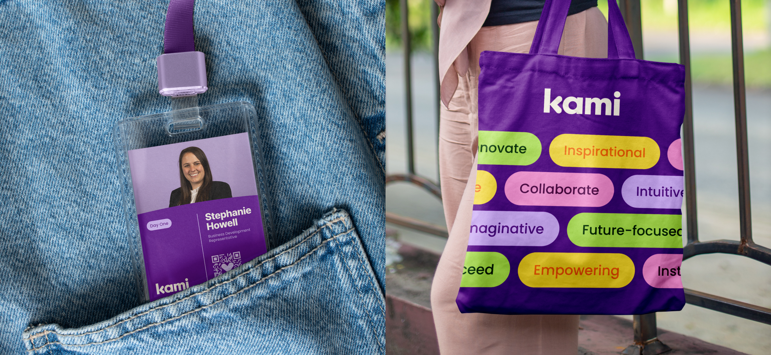
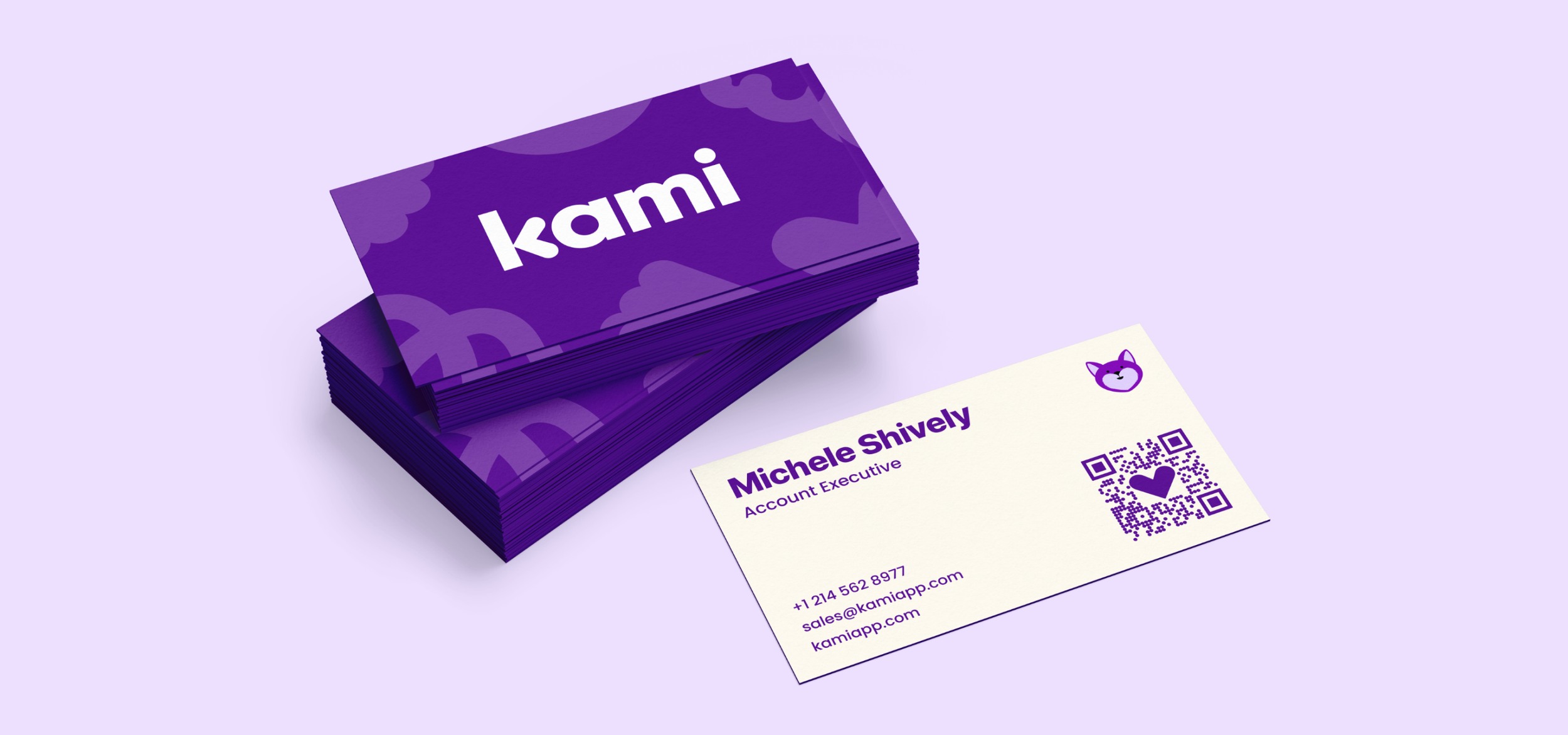
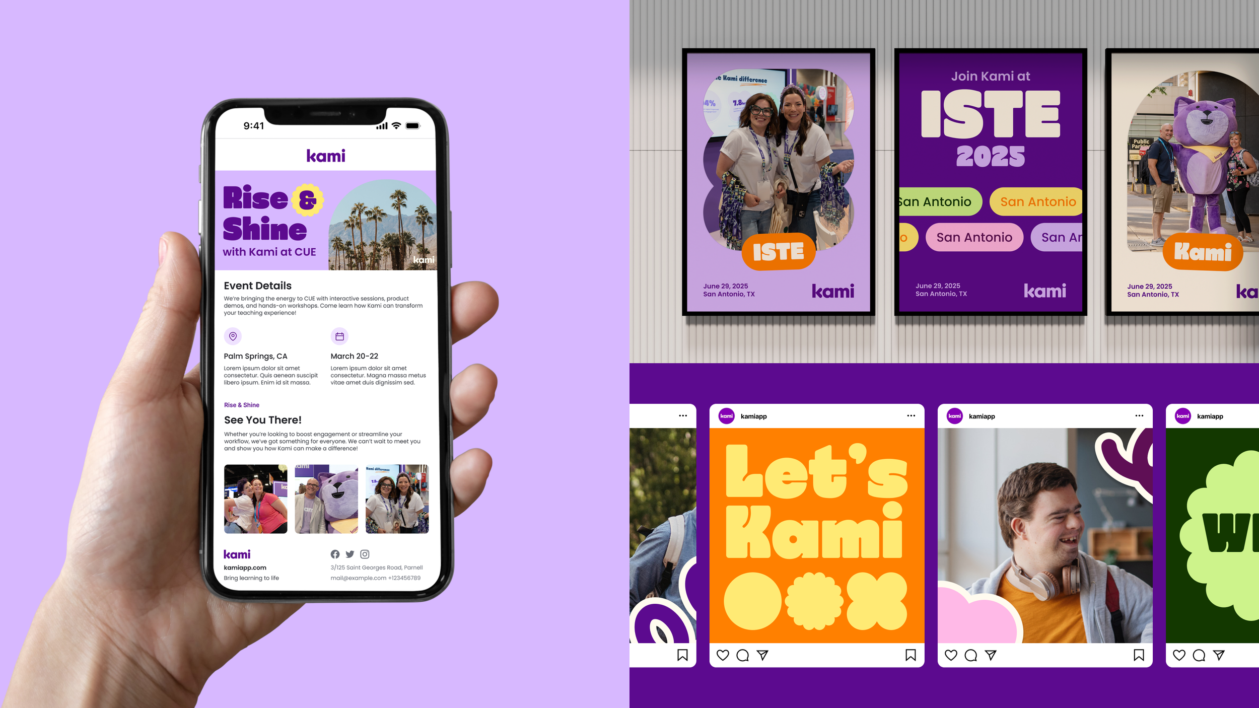
The rebrand gave Kami a stronger creative foundation across web, campaigns, product marketing and events.
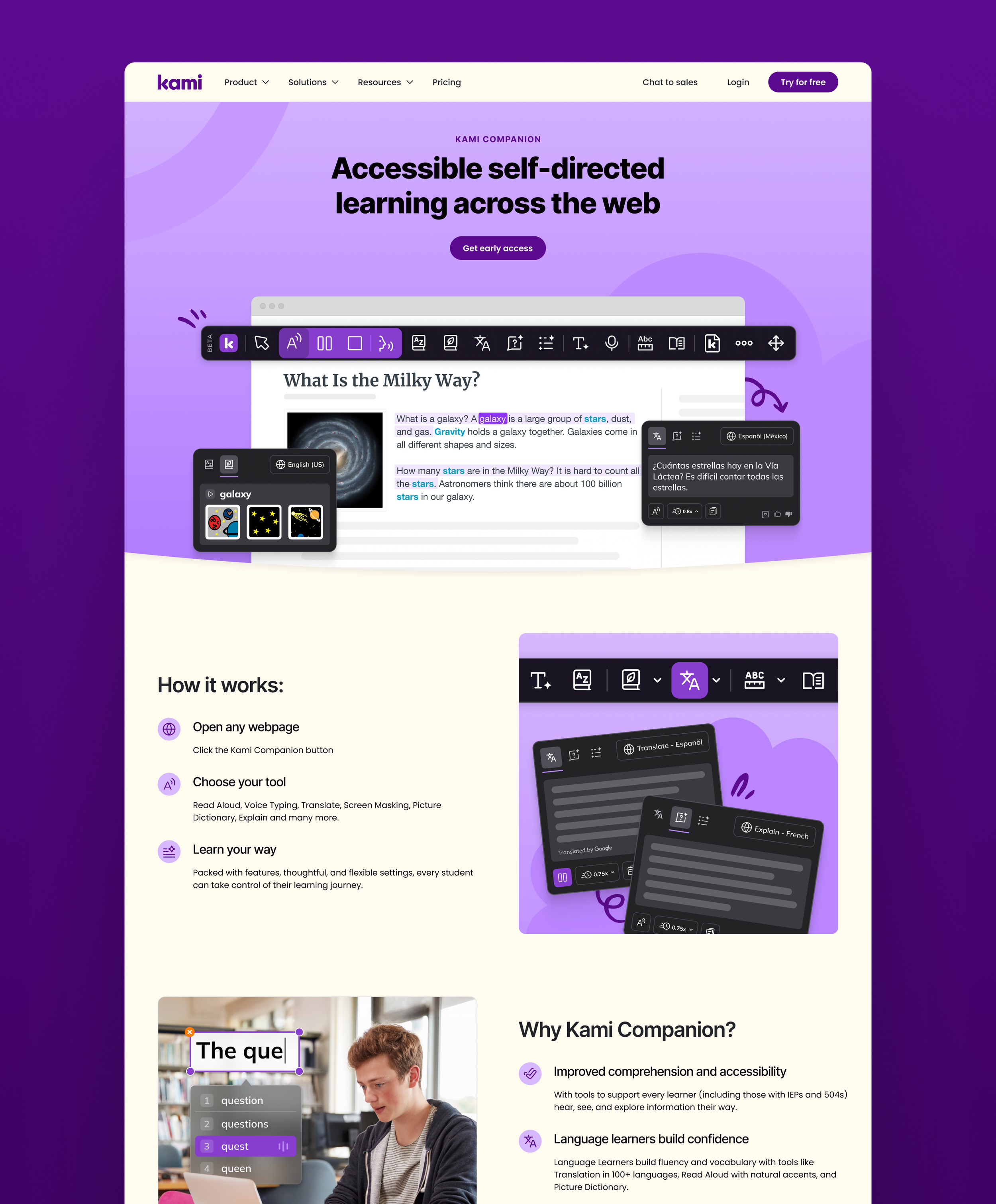
The updated identity kept the warmth and accessibility of the original brand, but introduced clearer hierarchy, stronger consistency and a more confident digital presence. Kami could now show up in a way that felt more polished, more recognisable and better suited to the company’s next stage of growth.
A clearer, more mature Kami
What changed
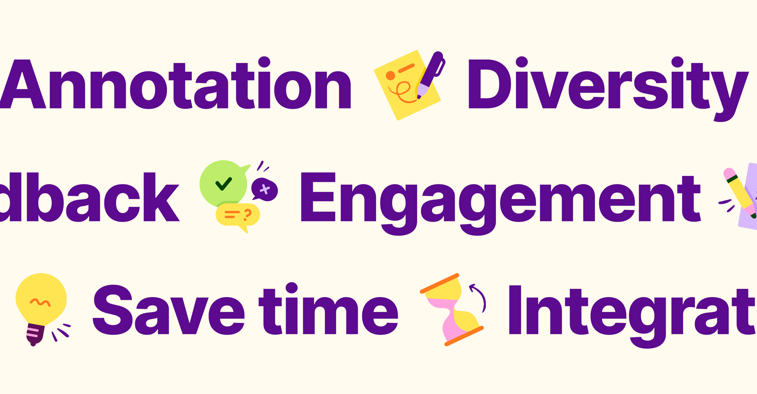
Stronger consistency across campaigns, web and events
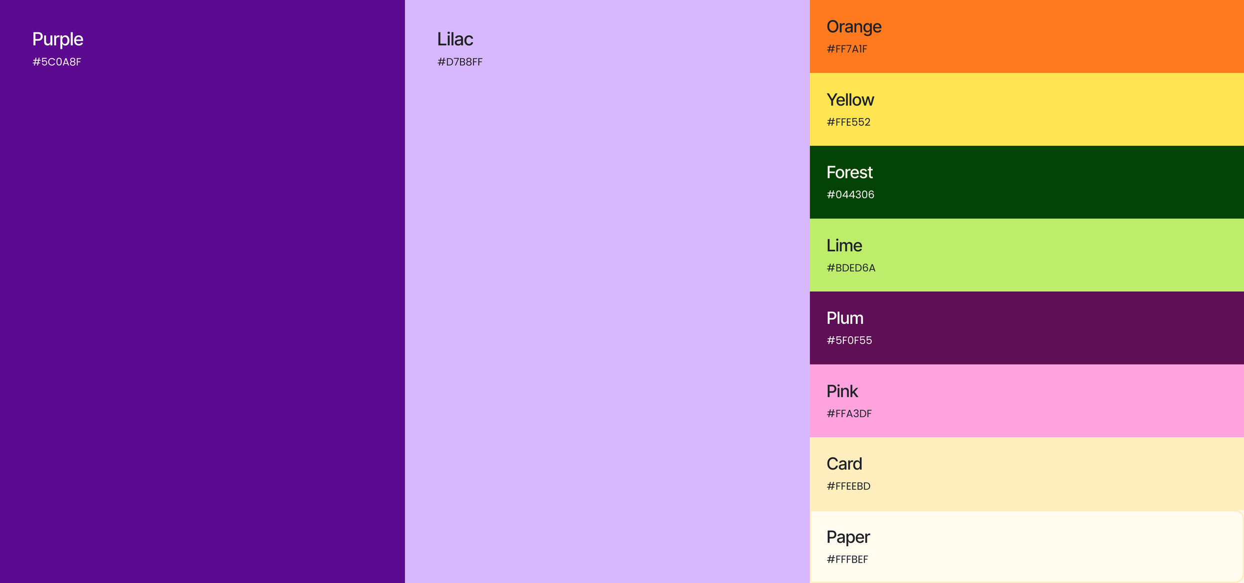
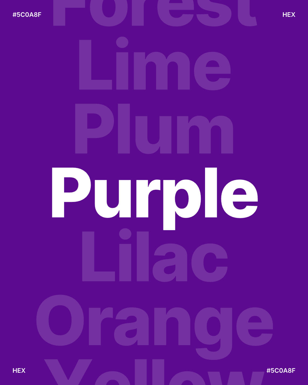
More refined colour usage and clearer brand codes across key touchpoints
Reusable guidelines and templates for faster delivery
A more mature brand presence for teachers, school leaders and decision-makers